TTC 7 Bathurst in a Storm
As I mentioned in my previous post, I've been archiving the TTC GPS reports. I've done a boat load (a big boat) of experimentation trying to figure out how to visualize this data - in the process I probably iterated over 12 different permutations of the UI for this, also different ways of storing and retrieving the archived GPS data. All said, I found that I needed to greatly reduce the scope of what I was trying to build for the sake of being able to finish it. So, this is what I've come up with. I suggest trying out the prototype before I really explain what it all is, that way perhaps you'll come up with better feedback as what you really think would be useful.
Here are some views of the interface, CLICK on them now to use the real thing. 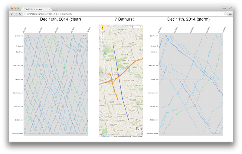
Alright, as for some basic explanation. After writing so much code, you'd assume a few paragraphs in English to describe it would come easy (it's not the case). What you've got here, is the 7 Bathurst bus and it's runtime performance December 10th and 11th, each day between 8am and 10am. On the 11th, there was a substantial snow storm which caused many parts of the city to .. well I donno, but I had fun because I don't need to drive. On the left, is the good day, on the right is the bad. I'm satisfied because the quality of service difference is instantly visible. But if I was only looking for lines, I would have been done this project when I started back in 2013. A bit of warning, thought it's already too late because I already told you to give it a try, it might seem a bit weird at first due to the substantial difference in the two axises for the graphs. One is time, the other is the progress along the vehicle's route. A dot in the middle of the graph would represent 9am and exactly half way between Steeles Ave and Bloor Ave. Though along the route that the vehicle would actually drive. (I took a particularly vertical and straight route for the simplicity of the experience)
In this case, you'll notice I'm showing both northbound and southbound vehicles - this adds a slight confusion but separating them seemed to increase the confusion in the ways that I tried to implement. The mild variation in colour for the vehicles is semi-random, just put there so you can tell them apart.
Mouse Over Interactions
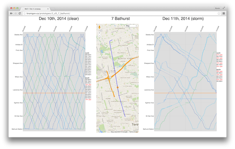
If you move the mouse over the map, it grabs the closest point along the shape and highlights that point on the map as a large orange dot. This 'selection' is a single point along the route, which is displayed on the two graphs as horizontal orange lines - any vehicles that pass that point are highlighted as small red dots. The times at which these vehicles pass this point are indicated to the right of each graph. Any substantial delay (>15 minutes) is indicated between the 'stop' times.
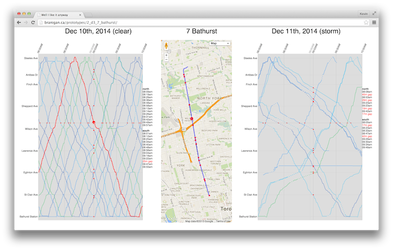
If you move the mouse over one of the two graphs, it draws two axis lines from that point. One vertical and one horizontal. The intersection point of these axis lines and the vehicle paths are significant. My gosh this is getting dull. The horizontal axis is the same as the orange line indicated by mousing over the map. The vertical on the other hand, are the positions of all the vehicles at a specific time. If you move your mouse over to 9am, the vertical axis line will have red dots on it. This is the progress of all the vehicles at 9am, the actual location of the vehicle is then displayed in a more useful way on the map.
Hardcoded
So, yes, the interface is completely locked down. Originally, I built the graphs with panning and zooming so you could explore any time and day, at the minute level or the hourly. And it's not _that_ much work to get it to work with other routes. I've had it working with the 510 Spadina and the 501 Queen, among a few others. The issue is the amount of work and server power required to provide access to all that data. My archive of GPS reports is about 70MB per day, but my strategy for retrieving reports random access style works fairly fast but is only really ideal in an environment with a few users. Because of this, I hardwired the script to pull from a specific time and day for a specific route. That way, the server isn't actually doing anything powerful - I cache the results and you never touch my fancy bits. Building this up to the level where anyone can freely explore all the data system wide all willy nilly is exactly what I'd love to do, but I simply don't have the server resources or developer time to do it. I'd love to build reliability reports for all the transit agencies that provide realtime data, average actual transfer times and predictive models of a transit agencies response to weather. Know a transit agency that's interested?