Traffic Jam
Over this weekend at TrafficJam, I worked with a great team of people making a project using an archive of TTC vehicle position data that I've been collecting. I've been working with this data for a while but really struggling to make something interesting out of it. That's where the team I was part of really helped out with the math and policy experience that I'm just not that familiar with. Together we built a tool to inform us of the current and past state of the traffic in the city. When busses run every few minutes on all routes, they become a regular and reliable dataset with which you can infer all sorts of knowledge. We decided to focus on traffic variance.
What that basically means is knowing whether a particular street is consistantly fast or consistantly no fun. If a road is terrible all the time, maybe you're sad but you aren't surprised and you aren't late for your interview at the City of Toronto Big Data Division for that nice role with the high salary, you know the one.
So here's the team, we won 1st place you know, no big deal. 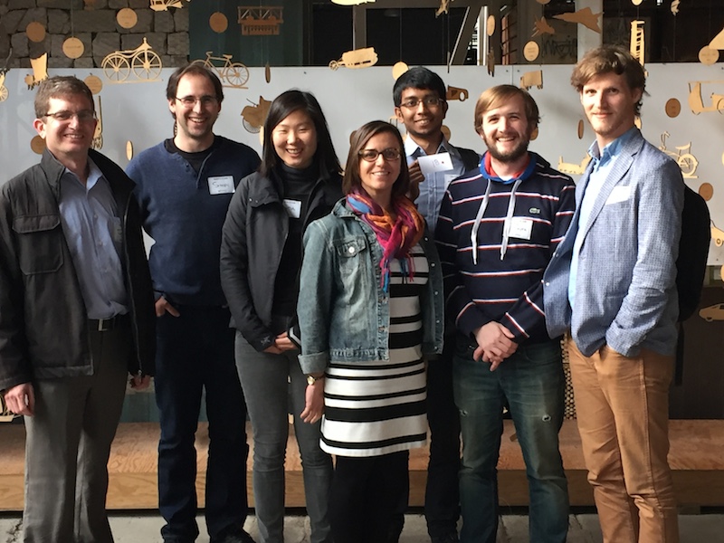 The team (left to right): Jonathan Dursi, Simon Freedman, Amanda Chou, Michelle Berquist, Tawsif Khan, Cathal Smyth and Kevin Patrick Branigan.
Naturally, a 48 hour event to build something leaves you with a project without frills (everyone likes frills) There are a lot of upgrades we want to do with this project and I hope the team sticks together to see them through. I'd tell you about the upgrade ideas but then that's all you'd look at instead of what it's already got.
This is a map of the city, blocked up geographically and by time, telling you the variance of the speeds of the vehicles found in each block. 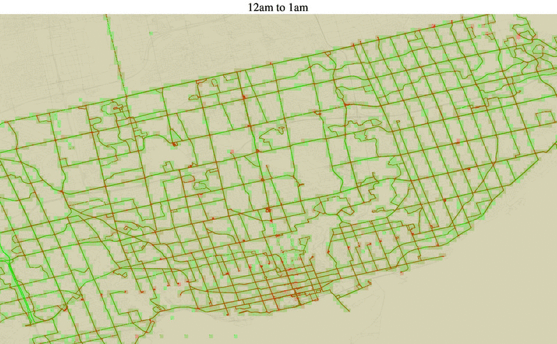
The above map is one week of gps reports but our analysis went through two full months of data. Highlighting the areas which are the worst is in the following map. 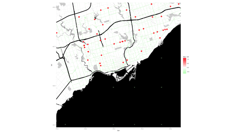
In conclusion, thanks!