Cold Walk Map
2012-11-01 · Kevin Branigan
The following is a rendering of all the addresses in the City of Toronto coloured according to their walking distance to a TTC bus stop or subway station. I used the myttc.ca trip planner for this. The address data contains information licensed under the Open Government Licence - Toronto, the street data is from Open Street Maps and the TTC data I collected and maintained myself since 2007.
Click here or one of the images for the full city. 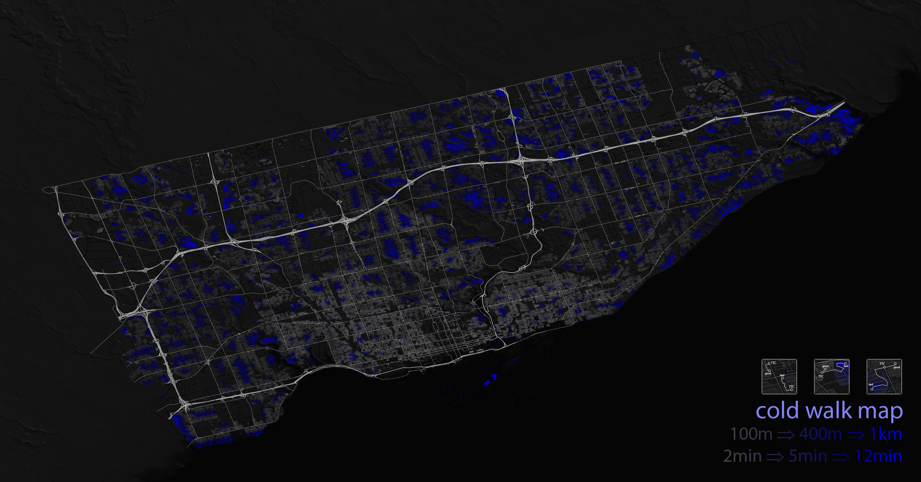
The idea is that the further you are from a bus station, the more blue your nose, ears and fingers will be. It took a few days to calculate all this, so do please enjoy.