Never-Stop Train Simulator
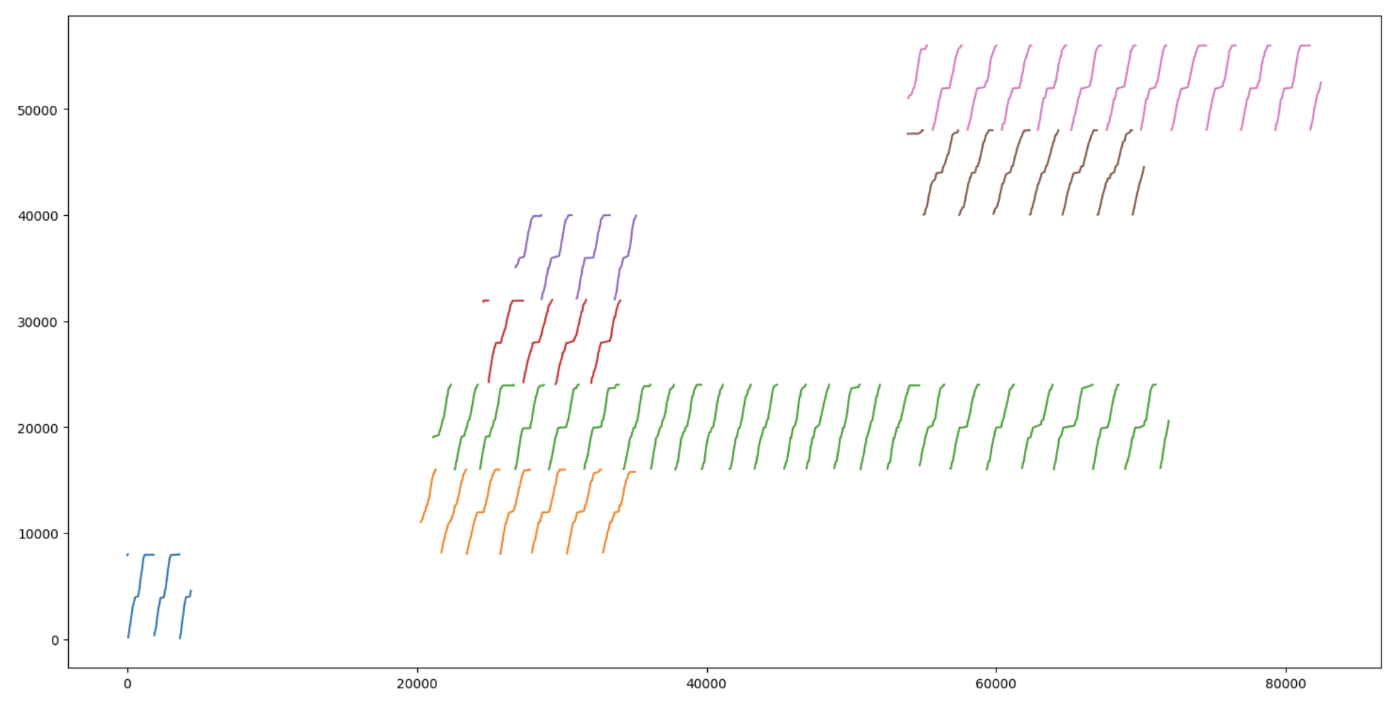
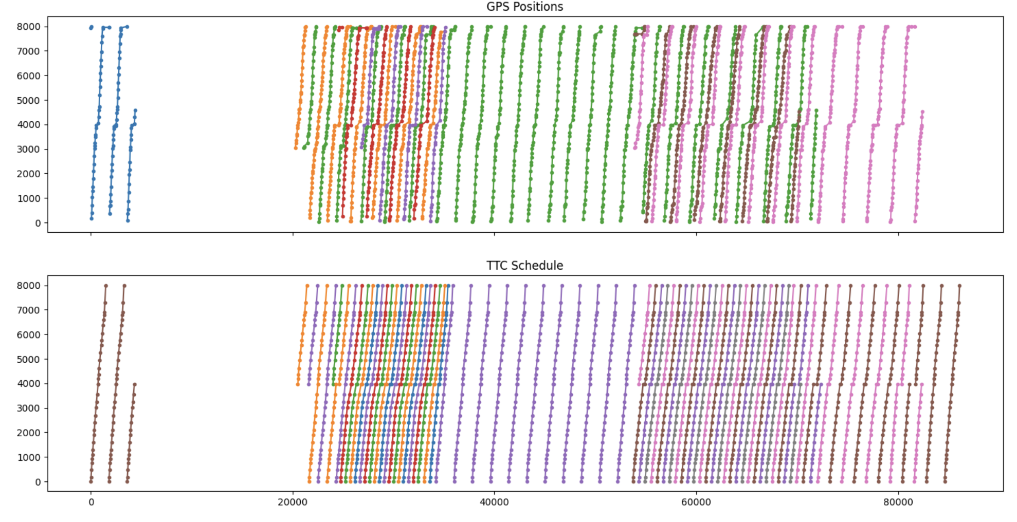
There is an issue I have with the subway in that it stops every few hundred meters but what I really want is a train that only stops at my destination - can you imagine how fast that would be? It might be a genuine contender to driving. So how do you get a train that only stops once? Ok so far the only way I've discovered is really having two trains, one that stops and one that goes. At first my idea was have the trains drive next to each other and open the doors at speed so people can transfer between the trains. Problem is of course the existing tunnels would have to be double wide and you couldn't support existing stations which have the platforms on the outside. So instead of side-to-side train connections, why not front-back? As a train approaches an empty station, the last few train cars detach and stop. The rest of the train continues driving along. As another train approaches that station, the train cars waiting at the station close their doors and start moving, it accelerates up to speed and merges with the front of that new train and becomes part of the new train. Once it's attached, passengers looking to go a large distance walk forward on to the new car. As a passenger, you can walk the length of the train as the front of the train gets new front cars from each station and looses back cars to the stations the train quickly drives through.
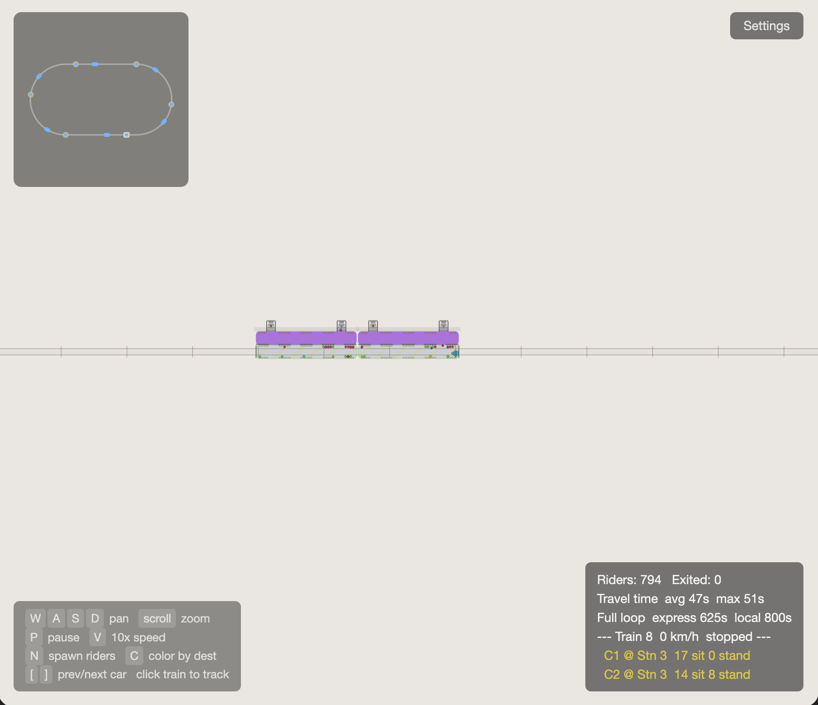
Here is the interface with the minimap, short train waiting in a station
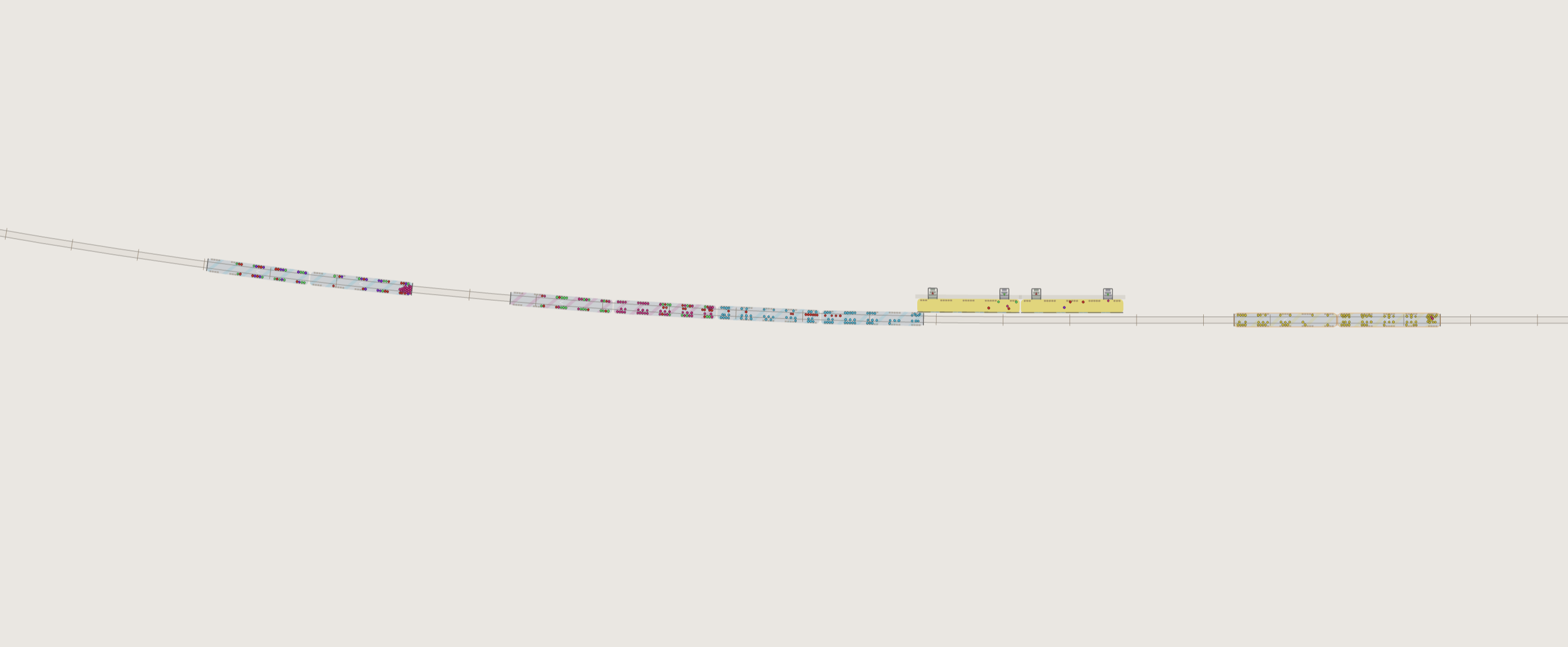
Here is a traveling train, the station is the 'yellow' station - the cars on the right side have detached and are approaching and stopping at this station. You can see the people on the train car are all yellow as well because this is their destination. The cars on the left are speeding up, aiming to match the travelling train. You can see people on that train. Some are sitting waiting, some are bunched up right at the back wall waiting for the trains to merge so they can walk backwards to get on the red train car behind them because they are going to the red station and that's where the red car is.
Originally I made this all in OpenGL and C++ but I wouldn't expect anyone to download a mac binary so I converted it to WebGL and wasm, so here it is: My Never Stop Train Simulator